Video overview
Overview Tab
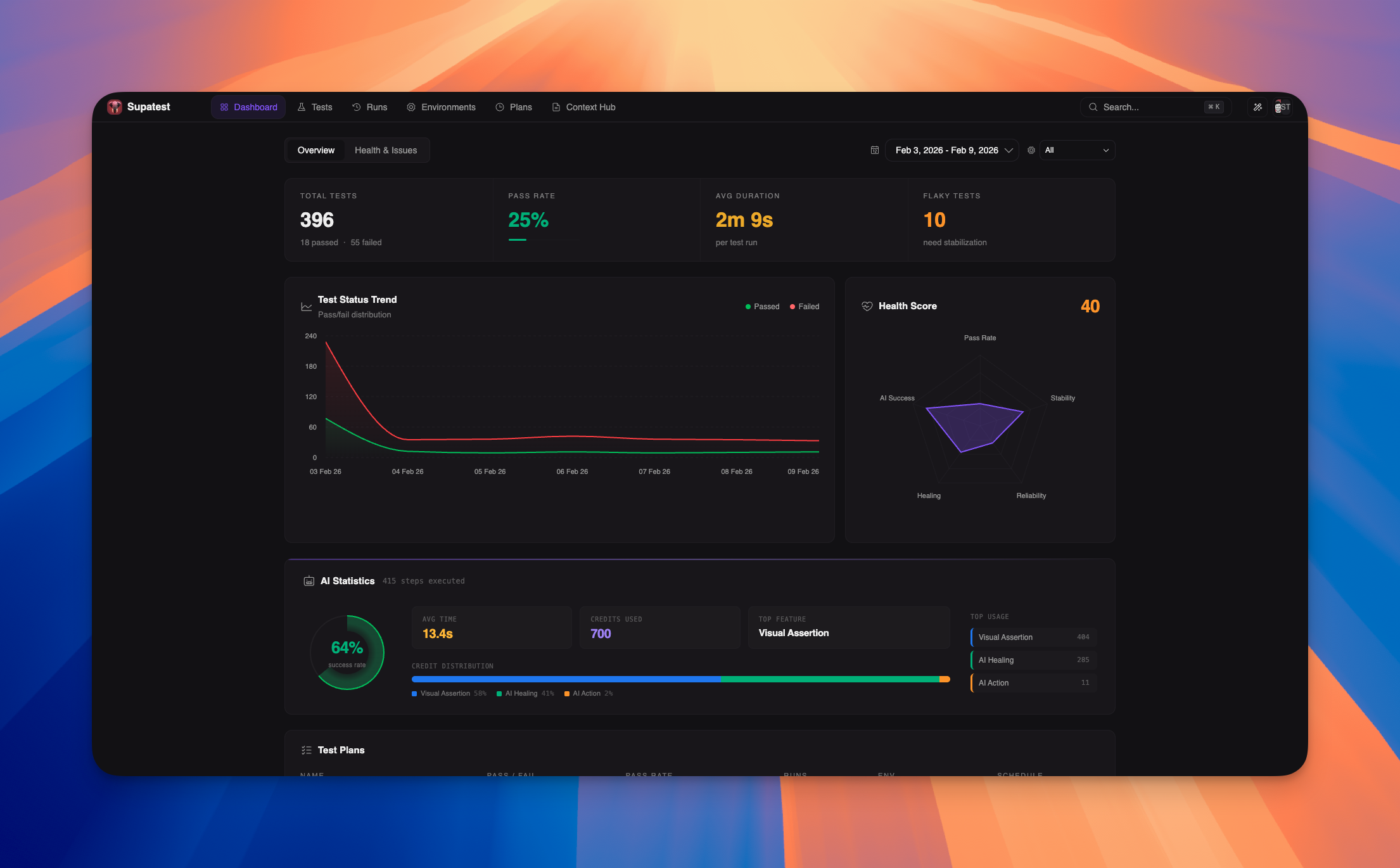
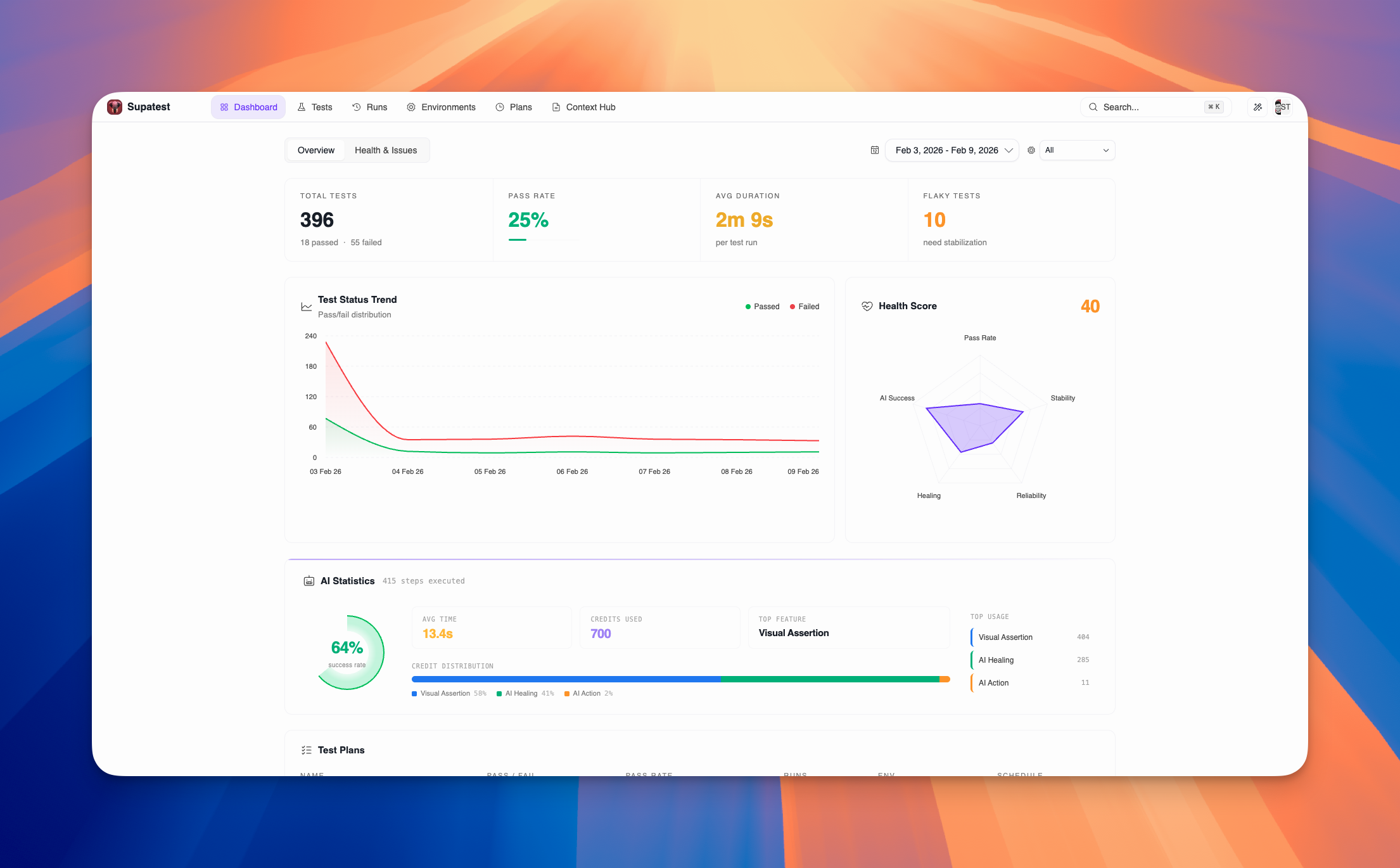
Use the Overview tab for quick health checks and high-level monitoring. It displays essential metrics, trend analysis, and AI usage statistics at a glance.Key Metrics
The top of the Overview tab shows four essential metrics that summarize your test suite’s current state:| Metric | Description |
|---|---|
| Total Tests | Total number of test cases with passed/failed breakdown |
| Pass Rate | Percentage of successful runs with visual progress bar |
| Avg Duration | Average execution time per test run |
| Flaky Tests | Count of tests with inconsistent results needing stabilization |
Test Status Trend
The Test Status Trend chart shows how your test results change over time as a stacked area chart.- Green area = Passed tests
- Red area = Failed tests
- Gradient fills for visual clarity
- Hover for exact counts and dates
Health Score
The Health Score radar chart provides a comprehensive view of your test suite’s health across five dimensions:| Metric | What It Measures |
|---|---|
| Pass Rate | Percentage of tests that passed in the selected period |
| Stability | How consistently tests produce the same result (inverse of flakiness) |
| Reliability | Pass rate trend compared to previous period (100 = same or improved) |
| Healing | Percentage of broken locators successfully healed by AI |
| AI Success | Success rate of AI-powered test steps |
AI Statistics
The AI Statistics panel provides comprehensive insights into AI-powered test steps:
- Large, visual percentage display
- Gradient glow effect for modern aesthetics
- Avg Time - Average execution time for AI steps
- Credits Used - Total AI credits consumed
- Top Feature - Most used AI feature
- Stacked bar chart showing credit usage by feature
- Interactive legend with hover effects
- Color-coded by AI feature type
- Ranked list of AI features by credit consumption
- Visual indicators with color-coded borders
- Hover interactions for detailed insights
Test Plans
The Test Plans section displays the health of your scheduled test plans:| Column | Description |
|---|---|
| NAME | Test plan name (clickable link to plan details) |
| PASS / FAIL | Color-coded counts (green/red) |
| PASS RATE | Progress bar + percentage (green/amber/red based on performance) |
| RUNS | Total number of runs |
| ENV | Environment badge (color-coded by type) |
| SCHEDULE | Schedule type (Daily, Weekly, Monthly, Hourly, Manual) |
Health & Issues Tab
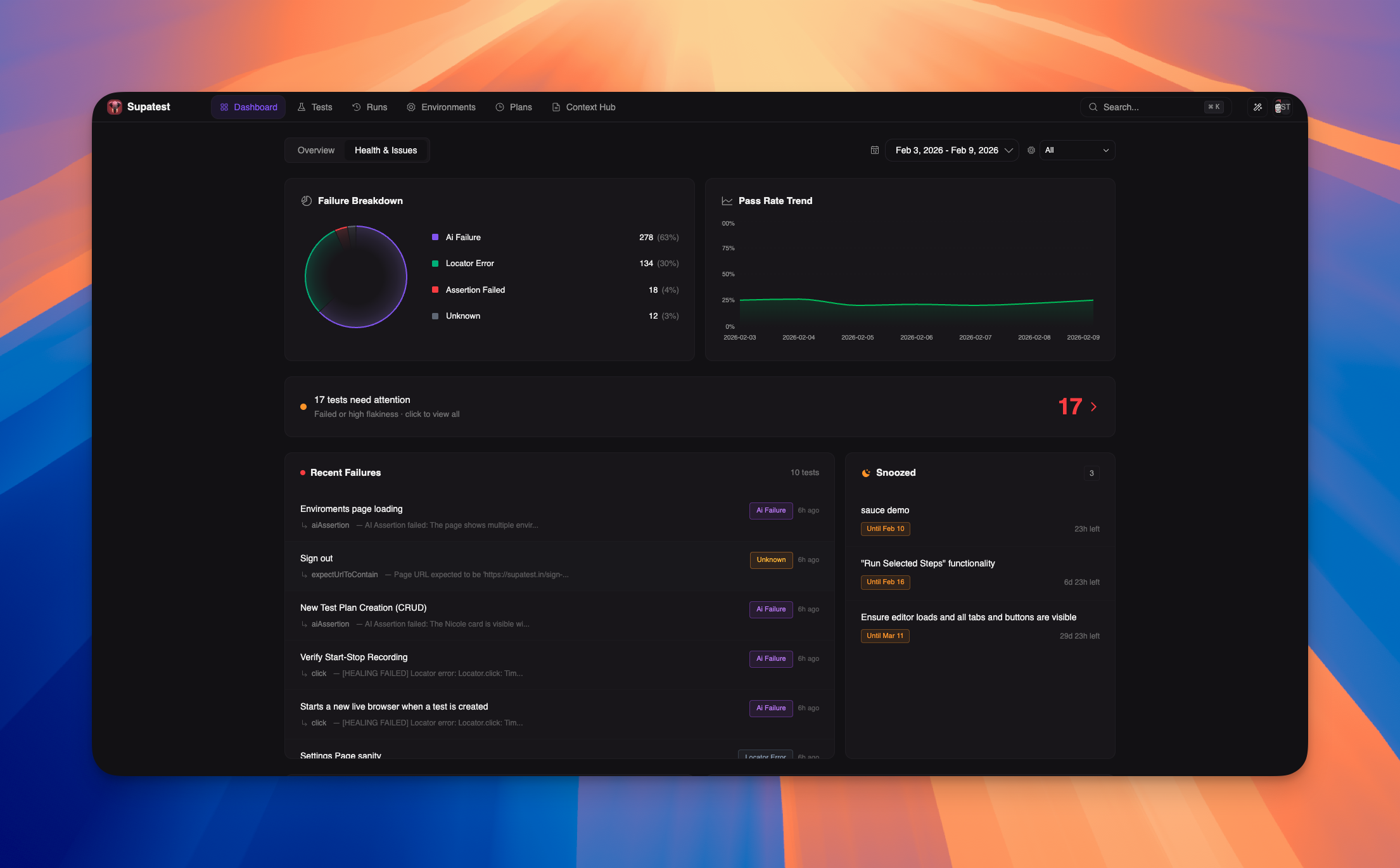
Use the Health & Issues tab for detailed failure analysis and troubleshooting. It provides deep insights into test failures, flaky tests, and areas requiring immediate attention.
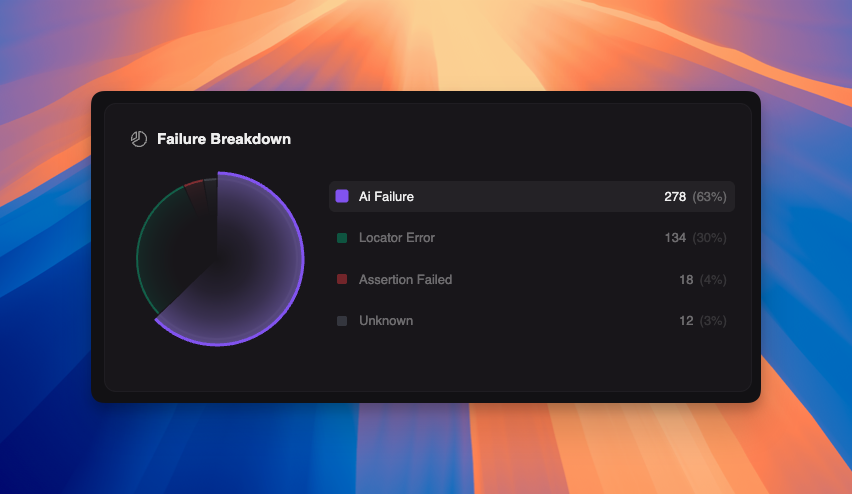
Failure Breakdown
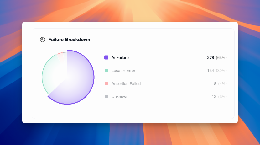
The Failure Breakdown chart categorizes all test failures to help you identify patterns:| Category | Description |
|---|---|
| AI Failure | AI-powered step couldn’t complete |
| System Error | System-level errors |
| Insufficient Credits | AI credits exhausted |
| Custom Code Error | Errors in custom code execution |
| Assertion Failed | Expected value didn’t match actual value |
| Locator Error | Selector couldn’t locate the target element |
| Network Error | API or network request failed |
| Timeout | Test exceeded maximum wait time |
| JavaScript Error | Browser console error during test |
| Unknown | Uncategorized failure |
- Hover over pie slices to expand and highlight legend items
- Click legend items to highlight corresponding pie slices
- Each category shows count and percentage
- Color-coded for quick identification
Pass Rate Trend
The Pass Rate Trend chart tracks your overall pass rate (0-100%) over time. This helps you:- Identify gradual degradation in test stability
- Correlate pass rate changes with deployments or code changes
- Set benchmarks for acceptable pass rates
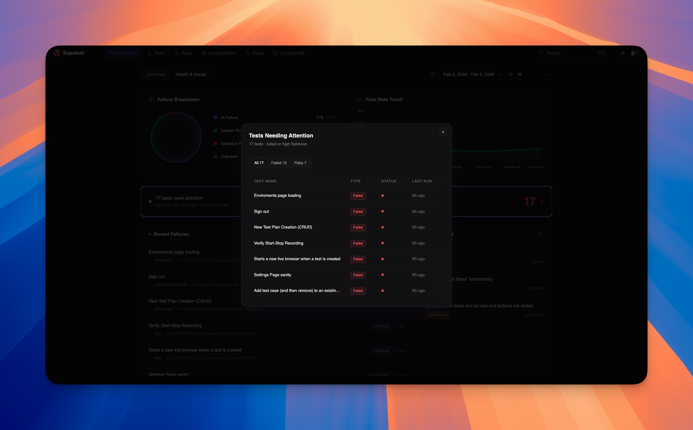
Tests Needing Attention
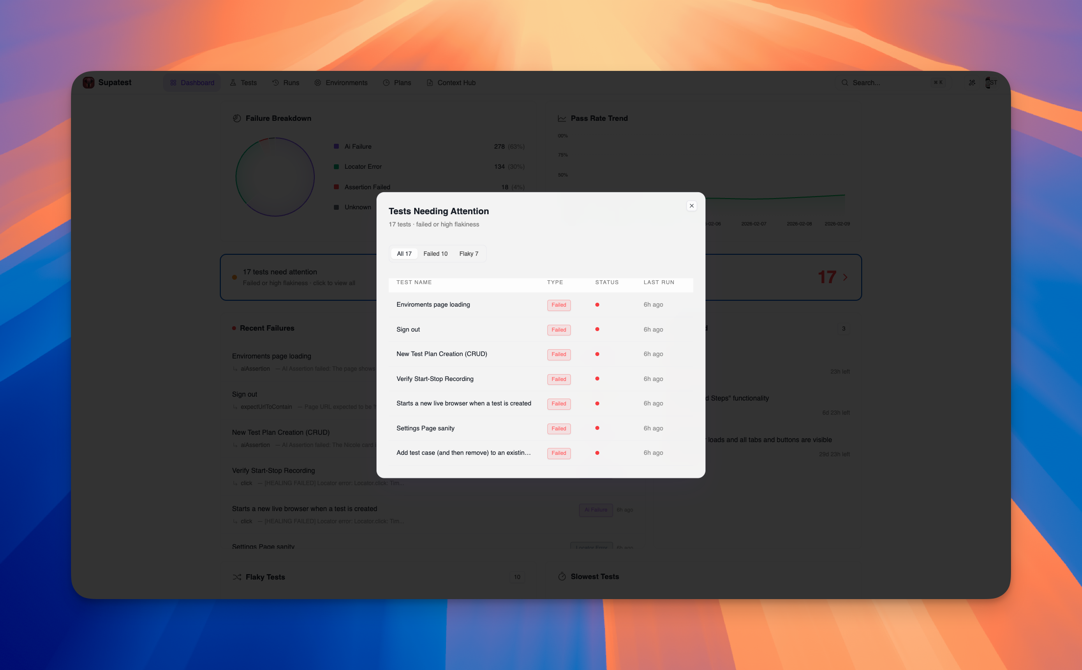
A prominent banner shows the total count of tests that need your attention, combining failed tests and high-flakiness tests into a single prioritized list. Click the banner to open a detailed modal with:- Filter tabs: All, Failed, Flaky
- Table showing Test Name, Type, Status, and Last Run
- Click any test to navigate directly to its details
Recent Failures
The Recent Failures list shows the most recent test failures. Each entry includes:- Test title (clickable link to test details)
- Occurrence count badge for repeated failures
- Failed step type and error message
- Failure category badge (color-coded)
- Relative time (e.g., “2h ago”)
- Full error trace
- Detailed error message
- Complete logs
Snoozed Tests
The Snoozed Tests section displays tests that have been temporarily suppressed from failure notifications. Each entry shows:- Test title (clickable link to test details)
- Snooze duration (e.g., “Until Feb 15” or “Indefinite”)
- Time remaining countdown
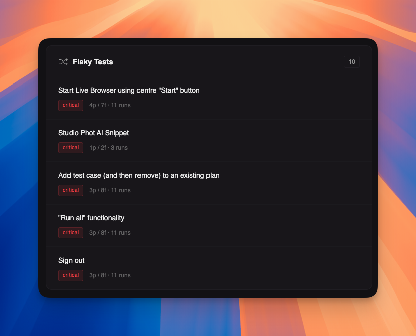
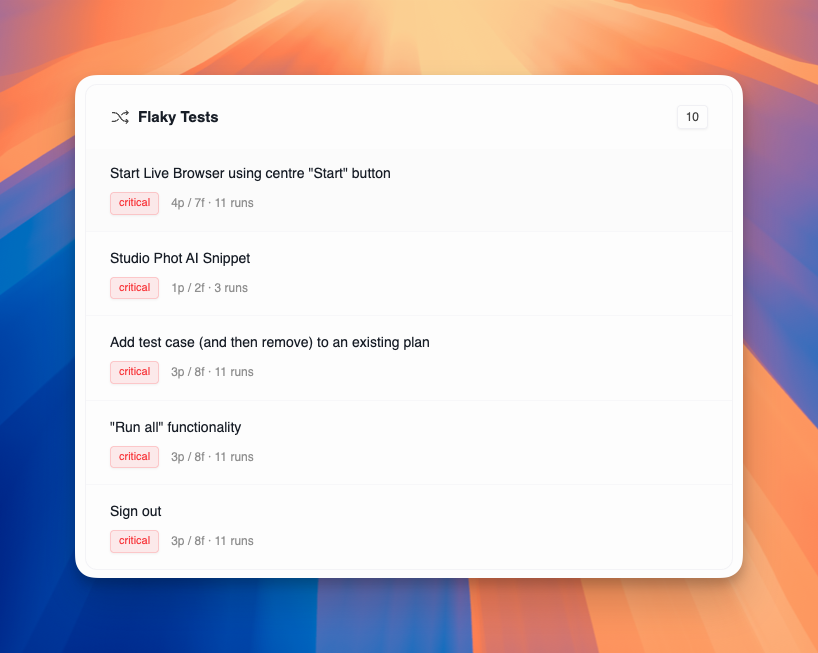
Flaky Tests
The Flaky Tests section lists tests with inconsistent results. Each entry shows:- Test title (clickable link to test details)
- Flakiness badge: Critical (red), High (orange), Medium (yellow), Low (blue)
- Pass/fail counts and total runs
- Race conditions and timing issues
- Dynamic content that changes between runs
- Network latency variations
- Shared test data conflicts
- Environment differences
Slowest Tests
The Slowest Tests section identifies performance bottlenecks. Each entry shows:- Test title (clickable link to test details)
- Run count for statistical significance
- Average duration in yellow text
Filters and Date Range
The dashboard supports several filters to focus your analysis:| Filter | Options |
|---|---|
| Date range | Today, Last 7 days, Last 30 days, Custom range |
| Environment | Filter by staging, production, or custom environments |
Best Practices
Daily Review
Daily Review
Check the dashboard daily to catch issues early. Focus on:
- Any new failures since yesterday
- Pass rate changes
- New flaky tests
- Health score trends
Use Overview Tab for Quick Checks
Use Overview Tab for Quick Checks
The Overview tab is perfect for:
- Daily health checks at a glance
- Executive summaries with key metrics
- High-level trend monitoring
- AI usage and cost tracking
- Test plan health monitoring
Use Health & Issues Tab for Deep Analysis
Use Health & Issues Tab for Deep Analysis
The Health & Issues tab is ideal for:
- Detailed failure analysis by category
- Investigating specific problem areas
- Managing snoozed tests
- Prioritizing flaky test fixes
- Understanding failure patterns
Prioritize by Impact
Prioritize by Impact
Address issues in this order:
- Tests needing attention (failed + high flakiness)
- Sudden failure spikes (likely environment or deployment issue)
- Critical flaky tests (eroding confidence)
- Slowest tests (blocking CI/CD)
- Long-term trends (gradual degradation)
Root Cause Analysis
Root Cause Analysis
For persistent failures:
- Check failure breakdown for patterns by category
- Review AI statistics for success rate trends
- Check health score metrics for specific areas of concern
- Compare against recent deployments
- Verify test data and environment variables
- Use hover tooltips on charts for detailed insights
Troubleshooting
| Issue | Solution |
|---|---|
| No data displayed | Run a test from the editor or a test plan to generate results |
| Pass rate dropped suddenly | Check recent deployments, data changes, or authentication issues |
| Tests are slower than usual | Inspect network calls and page transitions in the trace |
| High flakiness scores | Normalize comparisons (trim, lowercase), review waits and timeouts |
| AI steps failing | Check AI credits balance, review step configurations |
| Charts not updating | Try refreshing the page or adjusting the date range filter |
| Health score is low | Focus on improving the metric with the lowest score in the radar chart |
Related Pages
Test Plans
Schedule and automate test runs
Debugging Tests
Analyze and fix failing tests
AI Features
Learn about AI-powered testing
Environments
Configure test environments


